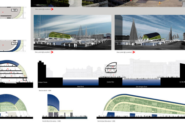
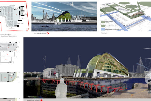
Centre Pier Galway Harbour
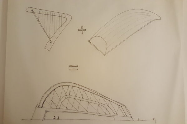
Barcarpa significa barca + arpa le due icone che rappresentano una la West Coast d’Irlanda e l’altra l’Irlanda intera. Abbiamo voluto riportare questo concorso di idee per tre motivi : il primo perché é stato il precursore di tanti progetti in paglia e canapa che costruiamo ora poiché oltre alla struttura in legno conteneva circa 3000 balle di paglia come isolante della copertura; il secondo per ricordare i bei momenti passati con gli amici e colleghi irlandesi con i quali é cominciata questa avventura; il terzo perché Galway quest’anno é capitale europea della cultura. Quello che segue é il report della design competition.
Concept
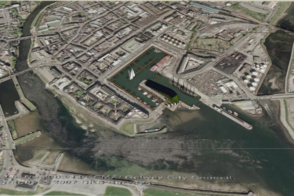
The old Galway Docks are a link between the city and the world, the urban and the maritime, the present and the past. Today, the Docks face one of their most
radical alterations as the old harbour core takes on a new life as a recreational and amenity hub; a new opportunity and a new layer on a long history. The proposed building will be part of this change and this design is intended as a link or a connection: a connection between old and new, city and docks, land and sea.
This site is critical to these transitions. Located on the Centre Pier, it is highly visible; on display from all sides, an urban ‘cat walk’.
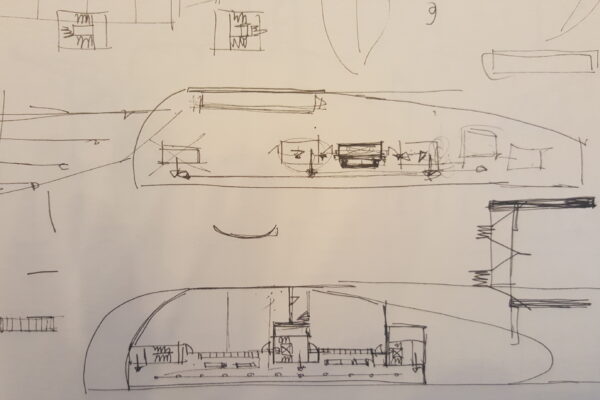
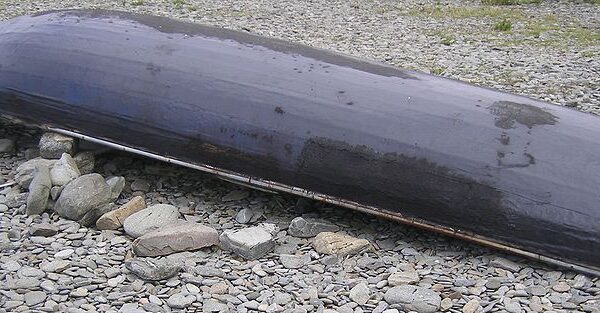
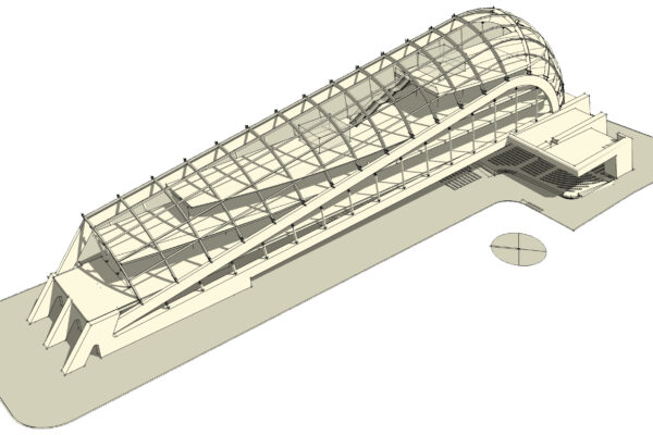
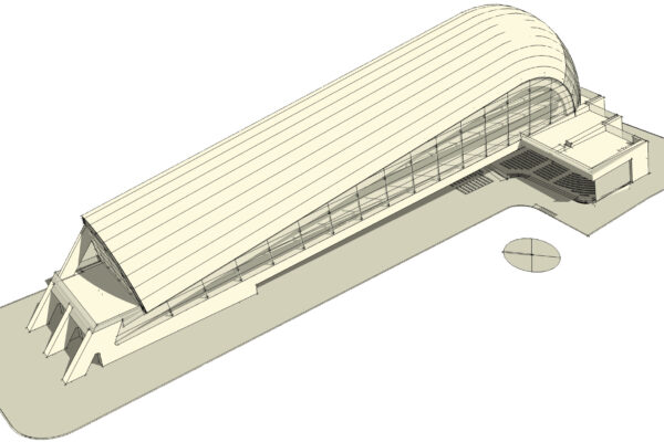
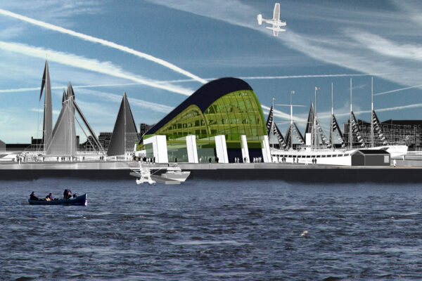
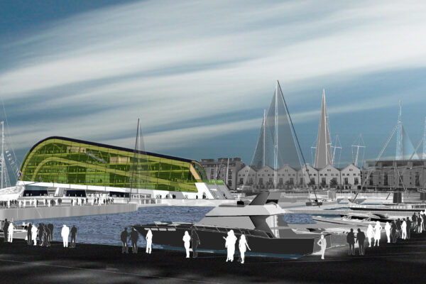
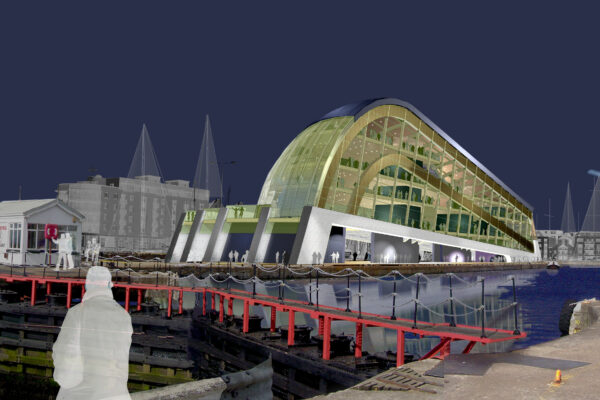
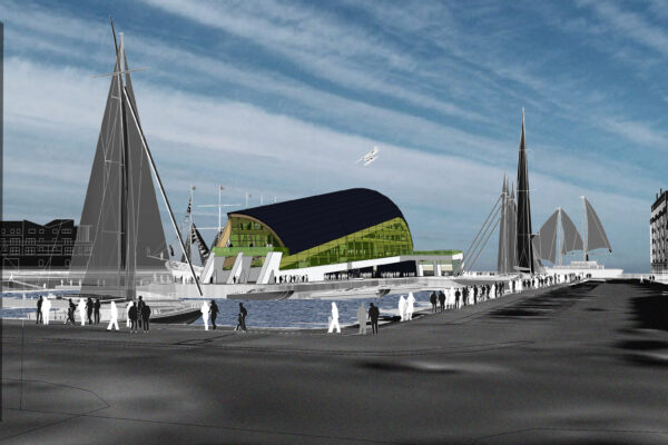
The building’s form is inspired by a traditional concept; the boat’s keel. The keel of a currach perhaps, in its traditional pose; up turned on the harbour campshire and propped up above the ground or hints of a Galway Bay Hooker for the unique profile of the keel (reflected on the glulam beams). The strings of a harp on the north east elevation to represent all the symbolism of the Celtic tradition. The scope is not to create a specific reference but to create more than one, a kaleidoscopic evocation of traditional local icons to stimulate imagination.
This shape, combined with a modern design and modern materials provides a strong link between the new function of the harbour as it moves to a new age of
recreation and leisure and to the old Galway and the old activities of the harbour, recognition of past generations of seamen and craftsmen.
Combined with this, the building will highlight crafted elegance. The timber beams of the internal shell structure promote a sense of craftsmanship and creativity, as opposed to the loss of identity and emptiness of skills of the “new economy”.
The bold shape links the docks and the city; the docks, located at the bay but yet in the city; urban streets and activities on one side and open sea with fine views of the Burren Hills on the other – they too provide rounded outlines reflective of the building’s shape.
Connectivity –ease of passage – is critical; links to the city and to the rest of the docks. Modern buildings create a visual block between docks and city, giving the
impression of much greater separation until one enters the immediate vicinity of the Docks where an open space is provided between the ‘walls’ of new development on each side. This building, lifted on pilotis, avoids a subdivision of this area and allows unrestricted movement at ground level.
It is a centre, not an edge and the strong form provides a visual focus for the harbour, re-asserting its maritime heritage in the face of the incursion of the City and its associated activities. As such, the building provides focus – clarity, volumetric integrity and dynamism. The ‘cat walk’ that is the Centre Pier is no place for the timid, the bland or the fragmented.
The long elegant line of the building, with its main axis pointing towards the open bay, provides an interconnection of city with ocean; views of the bay and the hills beyond will frame the structure. The rising form of the building’s roof (keel) draw the eye towards a final crescendo framed by this view and lead the urban activity towards its final destination and paradox, a sea related recreational centre that is yet at the heart of the city.
The trailing edge of the structure’s ‘keel’ leads to the city and softens the appearance as it is viewed against the backdrop of the Bay and the Burren hills.
Connections between the docks and the city are also a crucial element of the design and of the harbour’s future. Current access is by way of Breathnagh Quay and is adequate for the present. However, if the docks are to make a successful transition to recreational uses, the major opportunity site to the northeast will be critical.
These lands, in the vicinity of Quirke Quay and Dock Road are separated from the Centre Pier by the existing harbour channel. It is therefore proposed to provide a light weight pedestrian structure bridging this channel. This also improves movement in the direction of the main public arteries (car, rail and bus) which focus on Eyre Square..
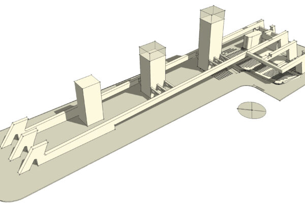
The building retains the dock walls which are part of a protected structure. It retains a completely open pedestrian route all around the building and allows ease of pedestrian flow under the building at ground level.
The Pier surface would be upgraded with Ashlar stone in a distinctive pattern. The spectator space is an open modern “cavea”. The green room & the storage area are the only indoor spaces built directly on the pier level, but for their size & location they can be considered as “Promenade Stores”, visually unobtrusive and
complementing the new promenade.
The building has an adaptable and open design. The location of the different functions are almost interchangeable. Only at ground floor is the position of the stage (& the spectator space) critical. Located at the exact same level of the Pier, the Pier itself becomes”the real stage”; backed by the bay they represent the “real scenario” & “canovaccio”.
Details
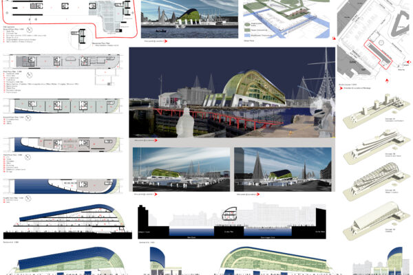
Open Space: 92% of the pier is left open to outdoor & sheltered activities (spectator space & market stalls). The envelope of the building from level one is kept as far back as possible from the dock walls (average of 7.5 m.).
Internal Circulation: Internal circulation is developed along the building’s transparent elevations; an outward looking, comfortable promenade of the urban/marine landscape, reaching its “Grand Finale” on the top level: the exhibition.
Sustainability: The responds to local climatic conditions. The aerodynamic silhouette of the shell & the shape of the “new piers” will ameliorate the south/westerly winds and protect the stage & spectator space. The long thin design allows rapid solar heat gain. The south/west elevation is reduced to avoid overheating & is designed to optimize solar gain. The building aims to maximize passive environmental control. It could easily reach a top energy rating with minimum cost.
Main Materials: The Shell is supported by a glulam structure, unexposed. The palette of the curved zinc roof is inspired by the metal bluish reflections of the bollards on the pier. The isulation of the roof is made by some 3000 straw bales. The Core uses white carbon neutral concrete known as ground granulated blastfurnace slag (GGBS). Finishes are minimalist. All materials are extremely resistant to marine corrosion & are maintenance free.
Buildability: Concrete structure & Shell could be all precast – Glulam due to its superior strength to weight ratio in comparison to structural steel. Because it is very light savings are achieved in cost and time of construction.
Conclusions: The design evolves from listened to the echoes of the traditions & the suggestions of this rich context. The message, the language & the techniques/methodologies adopted are natural consequences of the setting. The Centre Pier is the ‘cat walk’; the perfect spot for a symbolic gesture that moves people’s imagination, shaped by of its own culture and evocative of its memory.

